Companies and developers have long tried to write cross-platform mobile apps with very little platform-specific code. Many have since reconsidered due to laggy apps and complex development and maintenance.
The hard part about sharing code like this is that users expect to have high-quality, platform-specific UI. They expect it to be smooth and look like the rest of the apps on their phone. They don’t want to re-learn what a button looks like; they just want to use the app.
Companies, however, want to write code at scale. Teams want to design and develop something once and have it work on all platforms. They want their product to be easy to maintain and iterate on.
Kotlin Multiplatform Mobile (KMM) is the only cross-platform solution that I’ve found that achieves both of these things at the same time. The one-sentence explanation is that it allows you to share logic while writing a native UI for each platform. If you’re more curious than that, I recommend checking out the KMM homepage.

Problem
The advantage of KMM is that it doesn’t try to share UI across platforms, but what if we want the a consistent experience across platforms? We can share design fundamentals like spacing, colors, and fonts while still adhering to each platform’s guidelines.
Keeping these values consistent across platforms is also a foundational piece of creating a design system, which lots of people agree is a good idea for creating things quickly. Many who work on design systems call colors, spacing values, and typography details collectively “tokens,” a term which we’ll adopt here.
Ideally, we’d share these tokens in a way that we can update them in one place and propagate the change across all platforms. This allows us to be sure that all platforms are in sync and saves a lot of time when tokens change frequently.
So, how do we share design tokens across platforms with KMM?
We’ll start in this post by sharing only the spacing and sizing values, which we’re collectively calling “dimensions” from here on out. Future posts will explore sharing other types of tokens
TL;DR
- Create a
SharedDimensionsclass with the numeric spacing values in thesharedmodule- Add extension functions on each platform to convert the numeric values into
DpandCGFloatvalues- Check out the example code on GitHub
Assumptions
Before diving into the solution, we’re going to make a few assumptions to make our lives easier here:
- We’re using Kotlin + Compose on Android, Swift + SwiftUI on iOS. While these technologies are relatively new and many large apps have yet to fully migrate to them, they are undeniably the future of UI development on their respective platforms. They also share a lot of core ideas, making interop and maintenance simpler.
- We’re sharing our design tokens between Android and iOS only for now. While Kotlin can compile to almost any platform including JavaScript, we’re not going to talk about desktop compose or web. The ideas should apply similarly to any dynamic code-based UI framework (theoretically including React with CSS in JS). Non-dynamic frameworks like Android XML would likely require some code generation.
- We’ve already set up a Kotlin multiplatform app. We haven’t done much other than generated an empty project using the Kotlin multiplatform template and added Jetpack Compose on the Android side. All the code here in a compiling sample can be found in my snippets repo on GitHub. I’ll also link to the appropriate files throughout the post.
Goals
We’ll use the following goals to guide our solution:
- Simple: Easy to understand
- Maintainable: Easy to add new tokens or modify existing ones
- Organized: Easy to find a token + easy to know where to put new ones
- Concise: Should feel mostly native on each platform, with as little boilerplate as possible
Solution
The core idea is simple: add constants into a class like SharedDimensions in the shared module, add some extensions to interpret those dimensions on each platform as platform-specific types like dp or CGFloat, and provide the object as a CompositionLocal or @EnvironmentObject. Here, it’s simpler in a diagram:
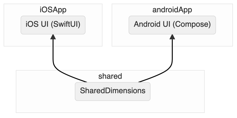
Don’t worry if that still sounds like a lot, that’s because it is. Let’s walk through all that together with some real code.
1. Establish shared dimensions in shared module
The first thing we need to to do is create an object in the shared module to contain the constants we want to share. We’ll call this SharedDimensions, because who needs creativity when you have boring clarity?
class SharedDimensions {
  val horizontalEdgeSpace: SharedDp = 24.dp
  val verticalEdgeSpace: SharedDp = horizontalEdgeSpace * 3
  val interItemSpace: SharedDp = 24.dp
  val halfInterItemSpace: SharedDp = interItemSpace / 2
  val intraItemSpace: SharedDp = 8.dp
  val minimumTouchTargetSize: SharedDp = 48.dp
  val dividerThickness: SharedDp = 1.dp
  val cornerRadius: SharedDp = 16.dp
}
You’ll notice we’re using a SharedDp type for these constants, and that type-safety is going to help us convert these to platform-specific values later. We can also add some operator and extension functions to make working with SharedDp easier:
data class SharedDp(val value: Double) {
  operator fun times(other: Double) = SharedDp(value * other)
  operator fun times(other: Float) = this * other.toDouble()
  operator fun times(other: Int) = this * other.toDouble()

  operator fun div(other: Double) = SharedDp(value / other)
  operator fun div(other: Float) = this / other.toDouble()
  operator fun div(other: Int) = this / other.toDouble()

  operator fun minus(other: SharedDp) = SharedDp(value - other.value)
  operator fun plus(other: SharedDp) = SharedDp(value + other.value)
}

internal val Int.dp
  get() = SharedDp(this.toDouble())
internal val Double.dp
  get() = SharedDp(this)
internal val Float.dp
  get() = SharedDp(this.toDouble())
2. Create extensions for Android
Our goal is to make SharedDimensions as easy and natural to use as possible. In Jetpack Compose, that would look something like:
@Composable
fun HomeScreen() {
  // ...
  Row(Modifier.padding(vertical = Dimensions.interItemSpace)) {
    // ...
  }
  // ...
}
We won’t quite get to that, but we can get pretty close with some choice extension functions. (See alternate approaches below for more about why we’re not getting to exactly this API.)
The first thing we need to do is convert from SharedDp to Dp. All we need is a concise extension that allows us to call Dimensions.interItemSpace() for now. I put this in a file called InteropExtensions.kt, but you can put it wherever you want.
operator fun SharedDp.invoke(): Dp = value.dp
Next, we need to make our SharedDimensions object available to our @Composable functions. We’ll do this through a composition local:
val LocalDimensions = compositionLocalOf<SharedDimensions> {
  // Expect that SharedDimensions is provided, like what MaterialTheme does
  error("Shared dimensions haven't been provided.")
}

// Easy accessor for our SharedDimensions object
val Dimensions
  @Composable
  get() = LocalDimensions.current
And now we can use it in our Composables, almost exactly how we wanted!
class MainActivity : AppCompatActivity() {
  override fun onCreate(savedInstanceState: Bundle?) {
    super.onCreate(savedInstanceState)

    setContent {
      MaterialTheme {
        // In a real app, we should provide SharedDimensions via dependency injection
        CompositionLocalProvider(LocalDimensions provides SharedDimensions()) {
          HomeScreen()
        }
      }
    }
  }
}

@Composable
fun HomeScreen() {
  // ...
  Row(Modifier.padding(vertical = Dimensions.interItemSpace())) {
    // ...
  }
  // ...
}
3. Create extensions for iOS
Same as on Android, we want to have a near-seamless way to use our SharedDimensions in SwiftUI:
import SwiftUI
import shared

struct Content: View {

  var body: some View {
    // ...
    HStack(spacing: dimensions.intraItemSpace) {
      // ...
    }
    // ...
  }
}
As before, we’ll get very close to this ideal, but not quite. (See alternate approaches below for more about why we’re not getting to exactly this API.)
The first thing we need to do here is convert our SharedDp values to CGFloat values so we can use them in SwiftUI.
It’s worth noting that on iOS, Kotlin effectively compiles the API surface of the
sharedmodule down to an Objective-C interface, so only some language features available in Kotlin are supported in Swift and vice versa. We won’t run into any of these limitations in our example today, but if you’re curious about them, I’d recommend checking out the official page on Kotlin interoperability with Swift/Objective-C.
import SwiftUI
import shared

extension SharedDp {
  func pt() -> CGFloat {
    CGFloat(value)
  }
}
Now we need to provide our SharedDimensions through an @EnvironmentObject. To do this, we need to mark SharedDimensions as an ObservedObject:
import shared

extension SharedDimensions: ObservableObject {
}
Note: I am not a Swift expert yet. This should work since nothing in the object changes, therefore not implementing anything special for the
ObservableObjectprotocol is technically correct. If you disagree or have any better ideas, feel free to send me a message!
Then we need to provide our @EnvironmentObject near the root of our view hierarchy. The App seems like a good place:
import SwiftUI
import shared

@main
struct iOSApp: App {

  var body: some Scene {
    WindowGroup {
      ContentView()
        // In a real app, we would provide this through dependency injection
        .environmentObject(SharedDimensions())
    }
  }
}
And finally, in use, it’s close to our no-boilerplate ideal. We just need to include our @EnvironmentObject and use our .pt() extension:
import SwiftUI
import shared

struct Content: View {

  @EnvironmentObject
  var dimensions: SharedDimensions

  var body: some View {
    // ...
    HStack(spacing: dimensions.intraItemSpace.pt()) {
      // ...
    }
    // ...
  }
}
4. Add or update a dimension
The main advantage of defining our spacing values in one place for all platforms is that we can more easily maintain it. Adding or updating a dimension is as simple as adding a val to SharedDimensions! And since we’re using extension functions to convert SharedDp values to their platform-specific versions, we only have to add our values in one place.
Let’s say, for example, that we want to add a new dimension for an icon on our home screen. We only want to use this value on the home screen, so we can actually add this to a child object like so:
class SharedDimensions {
  // ...

  val homeScreen = HomeScreen()

  class HomeScreen {
    val iconSize: SharedDp = 24.dp
  }
}
We’ve now added a namespace! This helps us organize our values as the app gets larger. We can access our new value just like any other, just with our new homeScreen namespace.
Android:
@Composable
fun HomeScreen() {
  // ...
  Icon(
    Icons.Rounded.Star,
    contentDescription = "Star icon",
    modifier = Modifier
      .padding(end = Dimensions.intraItemSpace())
      .size(Dimensions.homeScreen.iconSize())
  )
  // ...
}
Modifiers here. If we put .padding(…) after .size(…), the padding would be inside our 24dp icon size and would make the actual icon smaller.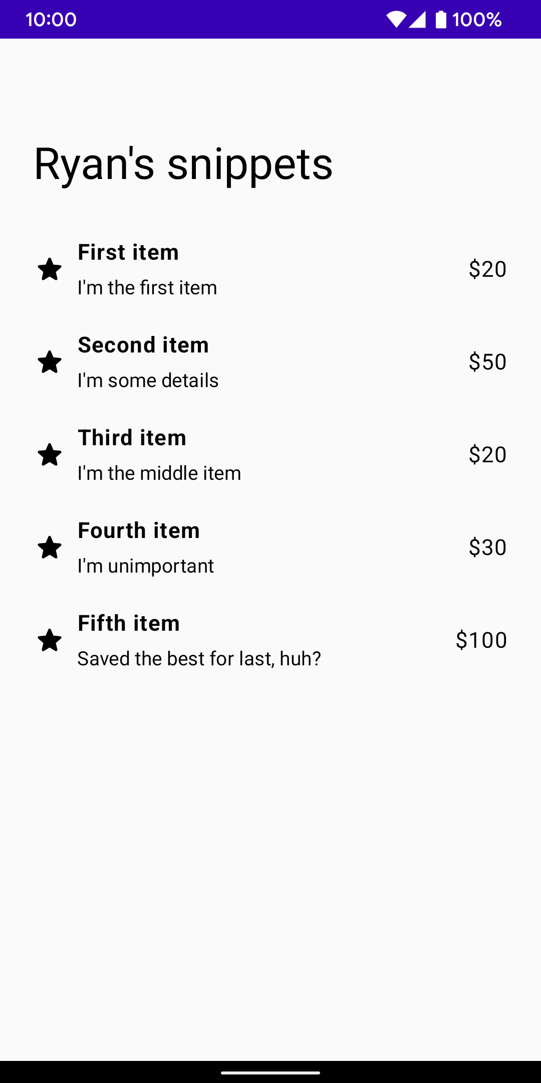
iOS:
import SwiftUI
import shared

struct ContentView: View {
  @EnvironmentObject
  var dimensions: SharedDimensions

  var body: some View {
    // ...
    Image(systemName: "star.fill")
      .frame(
        width: dimensions.homeScreen.iconSize.pt(),
        height: dimensions.homeScreen.iconSize.pt()
      )
      .padding(.trailing, dimensions.intraItemSpace.pt())
    // ...
  }
}
Extending the system
Since our system is defined in Kotlin, we can extend this system to handle most things a design system could need. For example, we could:
- Share complex calculations across platforms by declaring a dimension as a function instead of a
val. - Define new spacing values for different screens sizes by turning
SharedDimensionsinto an interface, and providing a differentCompositionLocal/@EnvironmentObjectdepending on the screen size. - Use
expect/actualto provide platform-specific implementations, if that was required for some reason. We probably don’t want this, but it’s technically possible.
Alternate approaches
There are obviously many ways to go about sharing tokens between platforms. I’ll briefly go through some alternatives I thought about and why I ultimately didn’t choose them.
Repackage SharedDimensions with platform types on each platform
The most concise version of this idea wouldn’t have the invoke() and pt() extension functions, instead exposing a Dp and CGFloat directly on our SharedDimensions object. And an earlier version of this did that by recreating our SharedDimensions object on each platform and exposing the correct type. This ended up being way too much boilerplate, so I ultimately I decided to accept a small amount of boilerplate when referencing dimensions to save a lot of boilerplate when adding/updating dimensions.
Code generation
This approach would generate code for each platform as a build step, allowing for an API perfectly tailored for each platform. It would also allow us to extend this system to other platforms, like Android XML and web. However, it would require a lot of work to write and maintain the code generators for each platform, more work than I want to take on for a side project.
All that said, this is the approach I would recommend a fully-staffed team should take, especially if there’s a separate Design System team. It’s some work up-front, but it pays for itself in its flexibility and extensibility, and its ability to work on any platform.
Conclusion
How’d we do against our goals?
- Simple: ✅ Our solution uses no new libraries and very little, readable code.
- Maintainable: ✅ Anyone with access to the shared library and a little kotlin knowledge can add a new token or modify an existing one. Our extension-oriented design works well in modularized enviroments, too.
- Organized: ✅ Nested classes allow for effective namespacing, making it easy to find existing tokens and know where to put new tokens.
-
Concise: ✅ Extension functions on our
CompositionLocals /@EnvironmentObjects add only a little boilerplate.
That said, any important technical decision comes with trade-offs. Some that apply here are:
-
We can no longer use the platforms’ built-in resource handling. We have to re-implement Android’s built-in ability to change
Dimensionresources based on screen size. - Our tokens are defined in a non-standard format. This is the flip side of the flexibility we gain by defining these values in Kotlin. If we wanted to generate this code from a design tool like Figma, we’ll have to write a custom generator, and same if we wanted to generate design-program-compatible tokens from our Kotlin file. It’s not impossible, but a little harder than if our source of truth was a JSON or XML file.
These are two trade-offs I happily take (as a single-person team working on a small app) in order to have simple, maintainable, organized, and typesafe dimension values shared across platforms.
All in all, I hope you can see how simple it can be to share design tokens between multiple platforms using KMM. We don’t even need to pull in libraries! I’ve been happy with this solution in the habit tracking app I’ve been working on (shameless plug), but if you see anything that can be improved, feel free to send me a message.